
Spotify Playlist Cover Size: Design It to Read Small
For a Spotify playlist cover, start with a square image. A 1000 × 1000 pixel canvas is a practical design choice: it gives you room to work and a straightforward file to export. That is our working recommendation, not an official minimum. Spotify’s current playlist help page explains how to change the artwork but does not state a required pixel size for an ordinary app upload.
The more useful question comes after choosing the dimensions: can someone recognize your playlist when the cover is small? A detailed poster can look impressive in an editor and become an unreadable patch of color in a music library.

Separate playlist artwork from release artwork
A playlist you curate and an album you distribute are different things. Do not automatically apply a distributor’s album artwork checklist to a playlist image. Spotify publishes separate requirements for release cover art, while its playlist customization guide covers the image you choose inside Spotify.
There is another distinction if you use a connected design tool. Spotify’s developer documentation specifies a JPEG upload with a maximum encoded payload of 256 KB for the playlist image API. That technical limit belongs to that upload route; it is not a universal file limit stated in the ordinary playlist help instructions.
If an export fails, first identify where you are uploading it. Follow the requirements shown by that app or tool, rather than shrinking the artwork repeatedly because a general size chart quoted a different number.
Choose a cover that describes the listening experience
Write a short description of the playlist before opening your design app. Name the sound and the occasion. “Quiet piano for reading” provides clearer direction than “a collection of great music.” It helps you decide what belongs in the image and what would create the wrong expectation.
Imagine a curator building a playlist called Evening Keys. One broad keyboard shape and a restrained title could communicate the subject. A collage of twelve instruments, several quotations, and a long subtitle would make the same message harder to find.
This is an illustrative example, not a real playlist or a claim about listening results. Your own selection might need a different visual language. The point is to make one recognizable decision, then remove elements that compete with it.
Make the small version first
Create your square canvas and add the main shape or photograph. Leave room around the title. Use a short name and a typeface that stays readable when reduced. If a decorative letter becomes ambiguous at thumbnail size, use that font elsewhere and choose clearer lettering for the cover.
Now make a small preview beside the full design. You can use a roughly 80-pixel square as a deliberately demanding check; this is a design exercise, not a claim about every Spotify screen.
- Recognition: Can you tell this cover apart from your other playlists without reading every letter?
- Subject: Does the strongest shape still suggest the intended listening mood?
- Contrast: Does the title remain distinct from the background, including its busiest area?
- Edges: Is any important letter or detail pressed against the boundary?
Fix the small version before adding more detail to the large one. If the artwork works only when enlarged, more pixels will not solve the underlying composition problem.
Keep a series consistent without making every cover identical
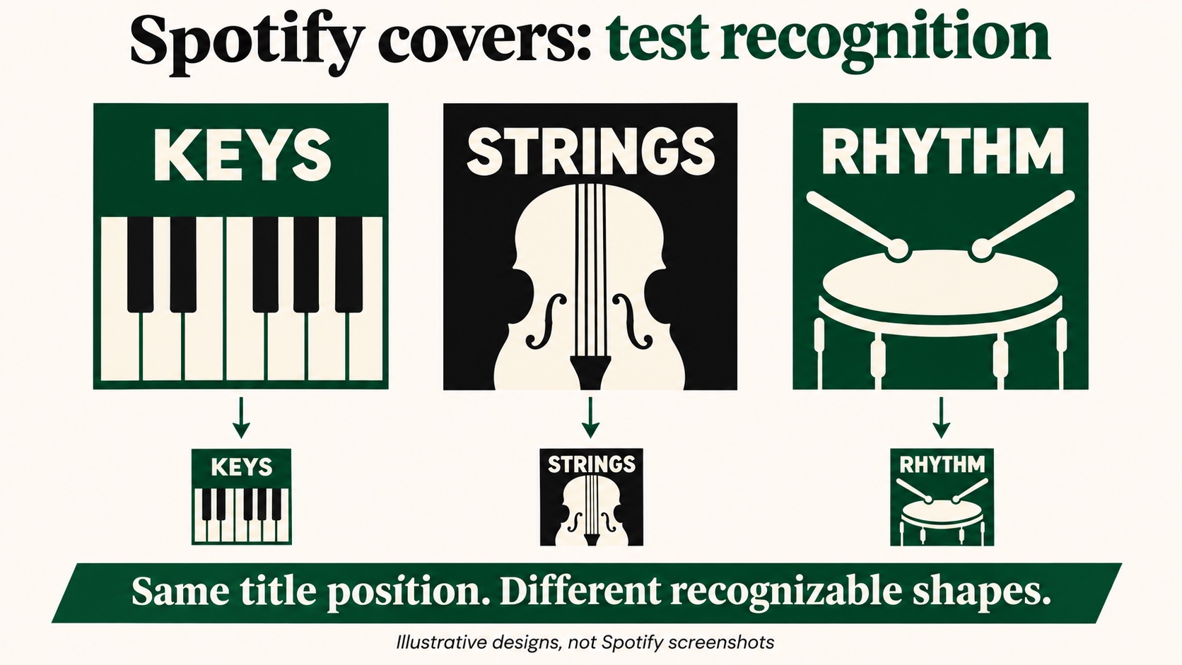
Curators with several playlists need both familiarity and distinction. Keep one element consistent, such as title placement, while changing a meaningful second element. A collection of instrumental playlists could retain the same lettering but use a different large silhouette for piano, strings, and percussion.
Place the covers beside one another during editing. Temporarily hide their titles and see whether you can distinguish them. If all three become the same dark square, adjust the major shapes or contrast. Color alone may not provide enough separation for every listener.
Keep the editable source file as well as the exported image. That makes it easier to update a name or extend the series without rebuilding its visual style.
Upload and check the saved artwork
For a playlist you created, Spotify currently gives these routes:
- Mobile or tablet: Open Your Library, open the playlist, tap Edit, choose Change cover image, select the image, and save.
- Desktop or web: Open Your Library, click the image on your playlist, choose a photo, and save.
The mobile app also offers Create cover art through Change playlist cover, with text, images, colors, and stickers. You can use that option when a simple design is enough.
After saving, inspect the playlist itself and its smaller library entry. Check the title, sharp edges, and crop. If the picture looks soft, return to the original export rather than taking a screenshot of the already compressed version.
Use artwork you created or have permission to use. An image appearing in a search result does not establish permission to put it on your playlist.
Before replacing an established cover, save the previous image and explain the new direction to anyone who helps maintain the playlist. A redesign should solve a recognizable problem, such as an unreadable name or misleading mood. Changing every visual element at once can make your own comparisons harder to interpret later.
Give the cover a playlist worth opening
Artwork can help listeners identify a playlist, but the title, description, and song selection have to deliver the experience it suggests. Listen through the opening tracks and check whether they fit the promise on the cover. Remove an outdated event reference or a seasonal label when it no longer applies.
If you intend to buy Spotify playlist followers, prepare these details before sharing the playlist link. Use the playlist’s own link, rather than an artist or user profile, and confirm it. A follower count and a satisfying listening session are separate measures; the artwork helps visitors recognize what they are choosing.
Keep a simple note of the cover version and the change you made. That record is useful when you revisit the design, especially if several people manage the same collection.