
Twitter Header Size: 1500 × 500 and What Gets Cropped
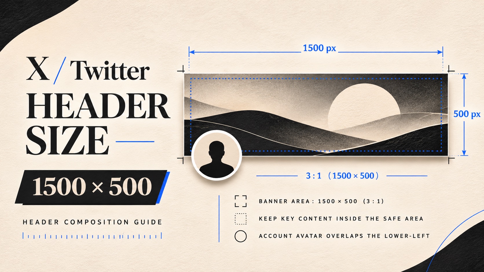
The recommended Twitter header size is 1500 × 500 pixels, a 3:1 rectangle. That is the starting canvas for your X profile, but it does not mean visitors will see every pixel. The profile photo overlaps the lower left, and the visible crop can change with the screen.
A header can have the right dimensions and still lose its headline. Before you export yours, decide what a visitor needs to understand, then give that message room. A recognizable business name and a clear reason to follow are more useful than a crowded collage that only looks good inside your design editor.
Start with the size, then plan for the crop
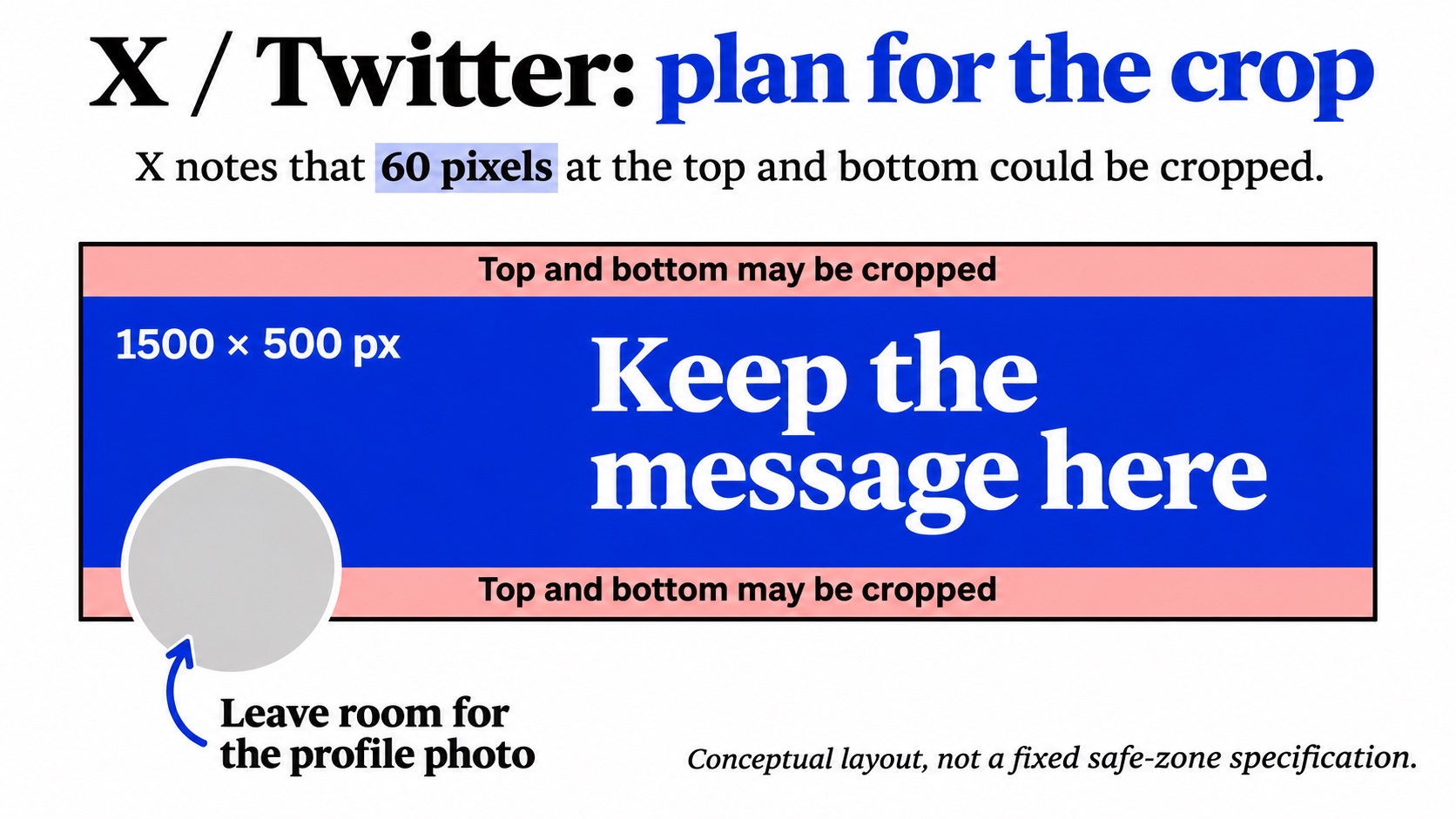
X recommends 1500 × 500 pixels for the header image. Its help page also says that 60 pixels at the top and bottom could be cropped, depending on monitor size and browser. Treat those edges as places for background color or expendable detail.
Keep essential wording farther inside the design, with extra room around the lower left where the profile photo sits. A centered message can still collide with that photo if the wording stretches across the entire banner.
There is no substitute for checking the saved profile. A template’s marked safe zone is a design aid, not a guarantee for every display. Use it to place your first draft, then inspect how your own header appears.
Give the header one job
Imagine a commuter bike repair business updating its profile. Its header could show a cropped bicycle wheel on the left and the words “Commuter-bike repairs” toward the center and right. The wheel can tolerate some cropping. The service description cannot.
That is enough for the image. Opening hours, the booking address, several testimonials and a seasonal discount would compete for attention in the same narrow space. Put detailed information in the relevant profile fields or a pinned post instead.
For a creator, the equivalent might be a short description of the work: “Practical lighting for small studios.” Choose wording that matches the posts visitors will actually find below it. A polished header should make the account easier to understand, rather than announce a different identity from the feed.
Write your message before choosing a photograph. Otherwise, you may end up squeezing important text into whichever corner the picture leaves empty.
Build and upload a clean version
- Create a 1500 × 500 canvas. Use an original image with enough detail for that size; stretching a small downloaded thumbnail will not restore missing detail.
- Place your main words away from the top, bottom and profile-photo overlap. Use strong contrast and a font that remains readable when the design shrinks.
- Export a supported file. X lists JPG, GIF and PNG for profile imagery, but does not support animated GIFs as headers. A still JPG or PNG is a straightforward choice.
- Open your profile, choose Edit profile and use the header camera control to upload the image. Apply the crop if prompted, then save the profile changes.
X’s profile customization instructions cover both the app and website. Menu presentation may vary, so follow the controls on your current version rather than a screenshot from an older tutorial.
Fix the problem you actually see
The words are cut off. Move them inward and reduce their spread across the banner. Do not immediately shrink every element: a smaller headline may fit, yet become unreadable on a phone. Removing a second line often works better.
The header looks blurry. Check the original export at its intended dimensions. If the source is already soft, improve or replace it before uploading again. If it is sharp locally, compare a fresh JPG and PNG export while keeping the layout unchanged. That isolates the file choice from the design.
The upload is rejected. Check the file format, connection and any error message first. Be careful with generic advice about a two-megabyte header limit: X’s troubleshooting page explicitly assigns its 2 MB limit to profile photos, while listing header dimensions separately. That page does not establish the same maximum for a header.
If the upload screen gives a specific requirement, follow that current instruction. Keep an editable master so you can change the export without rebuilding the design.
Make the rest of the profile ready for visitors
A header creates context; the bio, recent posts and destination link complete the introduction. Check that they describe the same offer. If your banner promotes repairs but your pinned post discusses an expired sale, visitors have to work out which message is current.
If you plan to buy X followers, finish this profile check first. Boost Social Media offers a follower service for public X profiles. Pair any audience-building activity with useful posts and clear profile information, so people who visit can quickly decide whether the account interests them.
The header is not a clickable booking button. Put the destination in the appropriate profile field and test that link separately. An address painted into the artwork may be recognizable, but it adds effort for someone trying to act.
Check the saved result at normal viewing size
Open the profile on a desktop and phone. Look for clipped letters, weak contrast and overlap with the profile photo. Read the headline without zooming. Then ask whether the image still makes sense if someone notices only the largest words.
Change one thing at a time if it fails. Move the text, save again and repeat the same check. Keep the final export beside the editable source, and note any offer dates that will require an update.
For the bike repair example, the review is simple: can you read the service description, recognize the wheel and find the booking destination below? If the wheel loses a few spokes at the edge, the design still works. If “repairs” disappears behind the profile photo, revise the layout. This separates decorative losses from information losses. Once those essentials survive both views, stop adding details. The header has done its job when a visitor understands the account before starting to read the next post.