
Facebook Page Action Button: Add, Change, and Test It
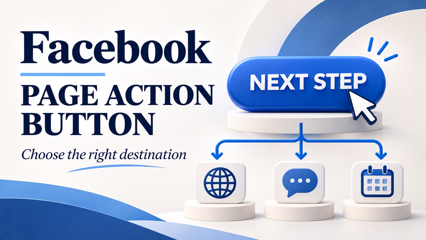
A Facebook Page action button gives visitors a direct route to a useful next step, such as contacting your business or opening a destination you choose. On a computer, switch into your Page, open Options, and select Add action button or Edit action button. Choose an available option, complete its setup, and save.
The setting takes little space on the Page, but the decision behind it deserves attention. Someone who has read your posts should not have to guess where to ask a question, arrange a service, or find the offer you just described.
Get into the right Page first
Meta says you need Facebook access to add or change the button. That is different from task access, which lets someone work through tools such as Meta Business Suite without switching into the Page on Facebook.
If you can schedule posts but cannot find the Page in your profile switcher, check your access with the person responsible for the Page. Repeatedly looking through unrelated menus will not fix an access mismatch. Meta explains the distinction in its Page access guide.
Also check the Page name before editing. A business with separate locations may have several similar profiles. The right button on the wrong location can send customers to a distant branch.
Add or change the action button on desktop
Use Meta’s current action-button setup instructions as your reference. The desktop sequence is:
- Open your profile photo menu and choose See all profiles.
- Select the Page you manage, then open that Page from the left menu.
- Choose Options and then Add action button or Edit action button.
- Select the available button that fits your intended action and choose Next.
- Complete the requested details, follow any remaining prompts, and save.
To replace an existing choice, Meta’s editing instructions specify Edit action button followed by Change button. Select the replacement, continue through the prompts, and save again.
The setup options in your own Page are the relevant choices. Avoid planning a campaign around a button label that you have only seen in an old screenshot. Check the available setup before writing promises into your posts.
Decide what the visitor needs next
Begin with the question people ask after seeing your content. A repair business might hear “Can you fix this?” before it hears “Which appointment should I book?” Those are different needs.
Consider a fictional bicycle repair shop showing a bent wheel in a post. If the job needs inspection before a price can be given, a clear inquiry route may be more useful than sending everyone to a calendar. The destination can explain which photographs and model details help the shop assess the request.
For a routine service with a defined price and duration, an appointment route may make more sense. The customer already understands the offer and needs an available time. Choose an option your Page actually supports, then configure it around that specific task.
A broader information destination can also be appropriate. If visitors need to compare two services before choosing, let them see that comparison. The most specific wording is not automatically the best wording when the customer is still deciding.
Match the promise to the destination
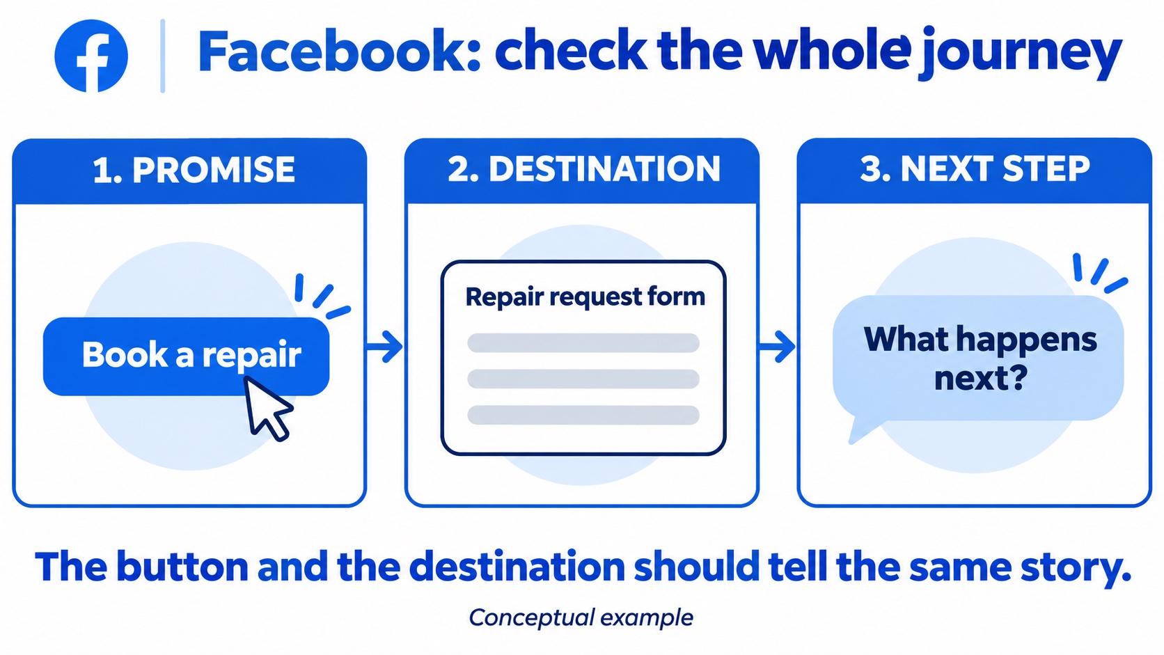
Read the button label, then open its destination. Does the first thing you see deliver what the label suggests? This simple check catches a surprisingly ordinary problem: the link works, but the visitor has landed somewhere unhelpful.
In the bicycle example, an inquiry about wheel repairs should not lead to a general merchandise collection. A booking request should explain whether the visitor is reserving a confirmed slot or asking the shop to contact them. Those distinctions prevent unnecessary uncertainty.
Review the journey in three parts:
- Promise: what action does the visitor expect after selecting the button?
- Destination: does the opening screen show the relevant service, location, or conversation?
- Next step: is it clear what to enter and what will happen afterward?
If the destination includes a form, request the information needed to handle that inquiry. Do not make someone complete an unrelated registration process merely to learn whether you offer the service.
Test the customer’s route on a phone
A successful save confirms that you changed the setting. It does not confirm that the complete customer journey is useful. Open the Page as a visitor and follow the button on a phone, then repeat on desktop.
Check whether the destination loads, whether its main action is visible, and whether the location is correct. Look for expired promotions, a calendar with no relevant appointments, or a form whose instructions disappear on a small screen.
For a contact route, confirm who receives the inquiry. A functioning button can still send a customer into an inbox nobody checks. Give the team a clear owner for responses and keep any stated reply expectations realistic.
Ask a teammate who did not build the destination to follow the route without coaching. Have them describe what they think they are requesting and what response they expect. If their answer differs from your process, revise the destination wording before changing the button again. This checks the meaning of the journey, not just whether a clickable element opens another page. Keep their unanswered questions beside your next revision notes.
Keep the Page and its follow-up ready
The button works best alongside posts that answer the questions customers bring to it. Show the service, explain relevant limits, and make the next action consistent with what your Page describes. A larger audience still needs that clarity.
If you plan to purchase Facebook followers, Boost Social Media’s Page package adds likes and followers from real accounts using the Page link. That changes the audience counts; it does not configure your button or guarantee inquiries. Finish the visitor’s route before treating a larger count as a completed marketing plan.
Record the chosen action, destination, responsible teammate, and review date. Recheck them when your services, branch details, or booking process change. A saved button should lead to today’s offer, with someone ready to handle the response.